Empathy
I carried out research to determine pain points and requirements for a good user experience.
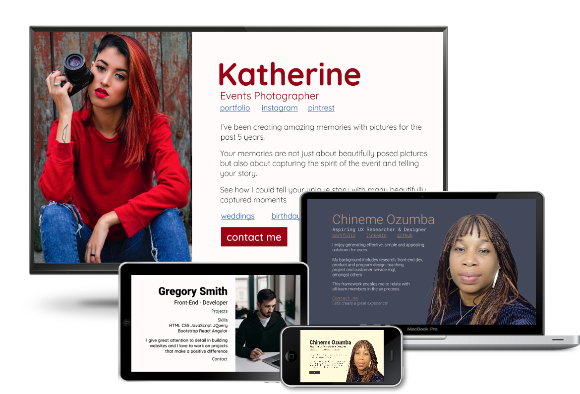
The Project: The Bill-Card page is a portfolio website landing page, which combines the strengths of the billboard and the business card, to give recruiters a concise overview of the candidate.
The Problem: Many candidates follow the latest trends on their landing page, such as motion graphics and parallax effects, at the expense of efficiency.
Recruiters on the other would like a quick overview of the candidate before engaging further.
My Role: I worked alone on this Research, Design and Development project from May to July 2020.
Tools and Coding Languages
I carried out research to determine pain points and requirements for a good user experience.
From the research I was able to define the problems users face
I generated the Minimum Viable Product idea
I created 3 prototypes of the MVP
I did hallway usability testing before producing the final design
The Users: Recruiters, potential employers and clients
Research method: Content analysis.
I analyzed lesson content for the IDF course ‘How to create a UX portfolio''
I analyzed online articles related to recruiters and UX portfolios on Medium such as 'What do recruiters and hiring managers look for in a UX portfolio' and 'UX design portfolio advice from hiring managers'
I analyzed best portfolio websites for various professions such as design, web development and photography which were outlined in listed in articles on Medium, codeburst.io and awwwards.com.
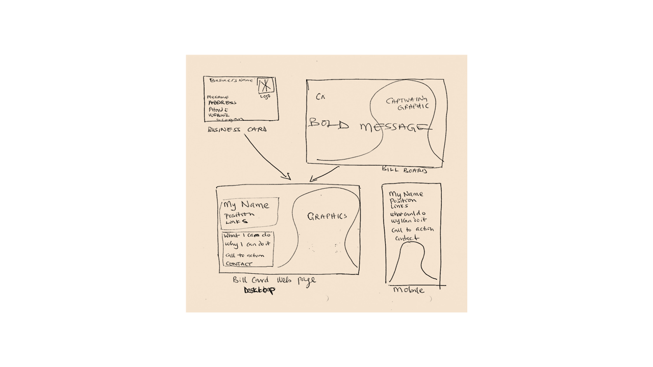
A minimum viable product that presents the full picture immediately. It should contain the following elements:
The name of the candidate
A bold picture – it could be of the candidate or a picture related to the title
The candidates current title
Relevant links
A short pitch
Contact link/ button
Sharp contrast for easy reading
Minimal and subtle or no motion graphics
Three Bill-Card prototypes were produced using Figma
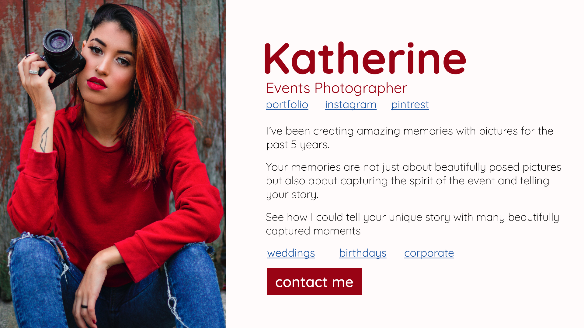
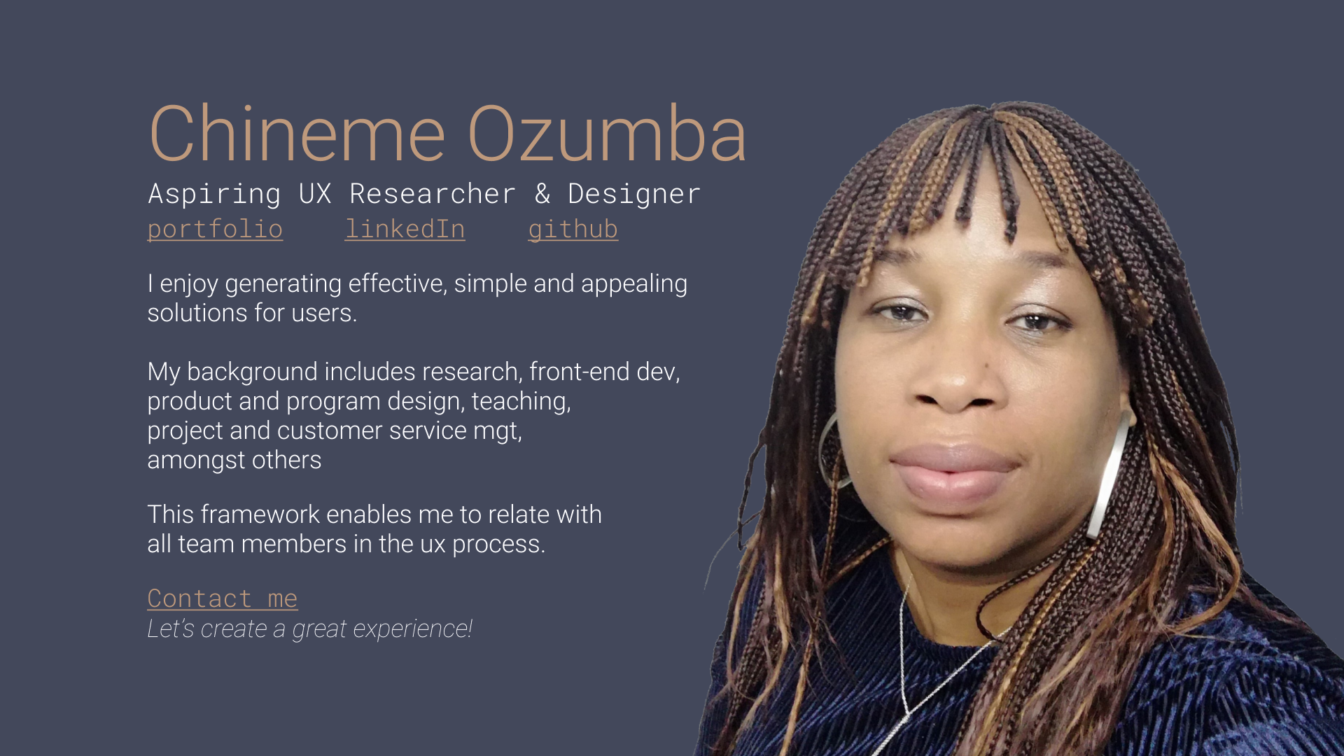
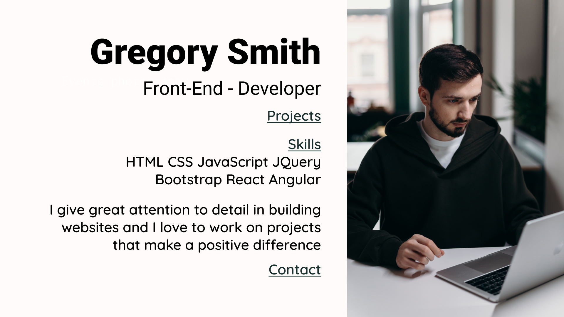
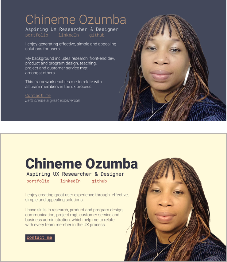
I started out with a dark look for my bill-card page. After hallway testing, I found out that it was a bit difficult for me, to let go my initial design because I really like the deep tone.
I had to remind myself that I was designing for the user (recruiters and potential employers) and not for myself.
Finally, I created the final design by combining elements from the 3 prototypes as follows:
the boldness and contrast of Gregory’s heading
Katherine’s contact button and the overall warm look
the flow of Chineme’s copy with her picture
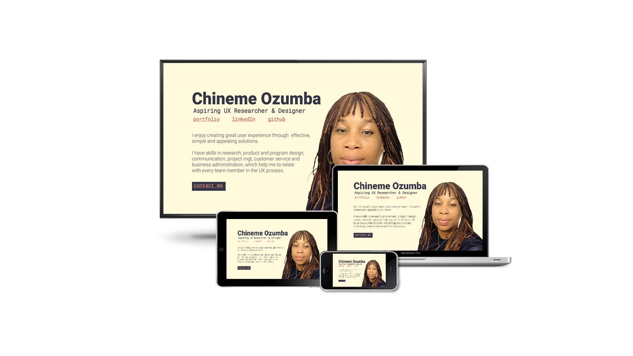
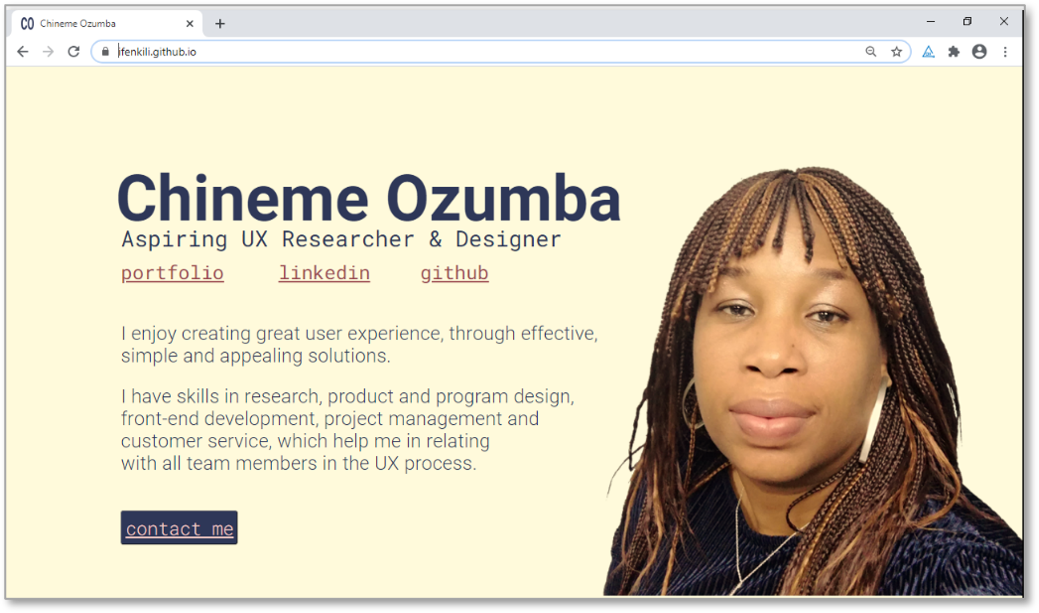
The heading is bold with good contrast
Picture is bold and blends well with the font color scheme.
The writing is balanced with the outline of the picture
Colored underlined links gives proper affordance
Copy presents the key elements that the user requires first: name, position and important links. Followed by a conversational section that projects the expected results of my work, why I can deliver such results and ends with a call to action button.
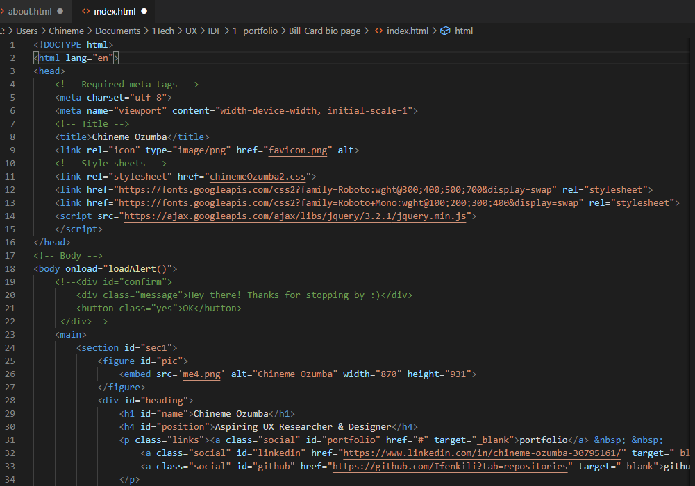
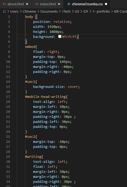
I hand-coded the web page using HTML5 and CSS3
I would like to thank the creators of the images used in this design
Photographer Photo by Marcelo Chagas from Pexels
Front-end developer Photo by cottonbro from Pexels
MacBook Pro by Unknown Author is licensed under CC BY-SA
iPhone by Unknown Author is licensed under CC BY-SA
iPad by Unknown Author is licensed under CC BY-SA
HD Screen by Unknown Author is licensed under CC BY-SA