
Section 508 Audit
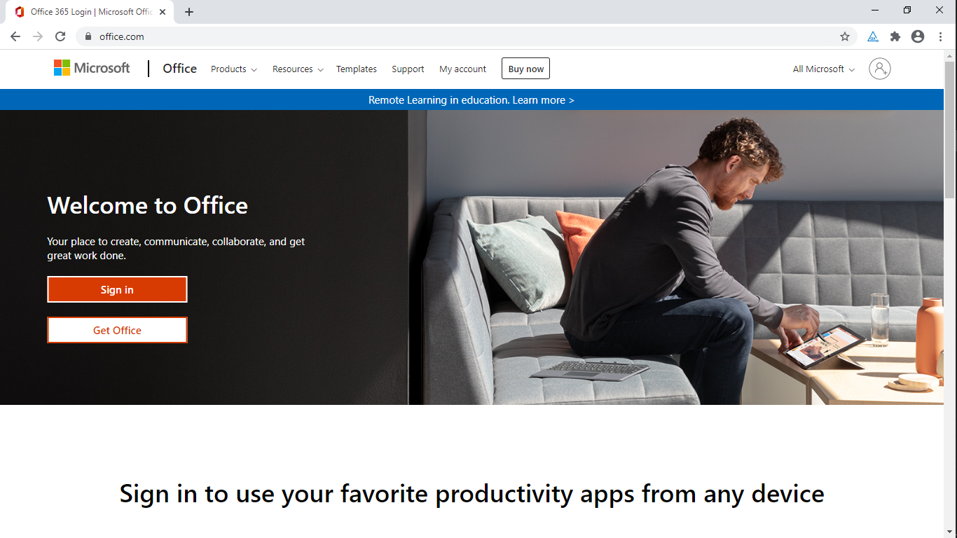
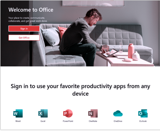
MS Office 365 login page
The story: US Government legislation mandates that all electronic and information technology be made accessible to persons with disabilities.
I analyzed this website to demonstrate my accessibility skills. I focused on other ways of checking accessibility apart from using screen readers. The analysis was done on May 8, 2020.
Methods applied: Observation, Keyboard test, WAVE accessibility tool, AXE chrome extension tool, contrastchecker.com, Toptal color blindness tool.

Evaluation with Wave Accessibility tool
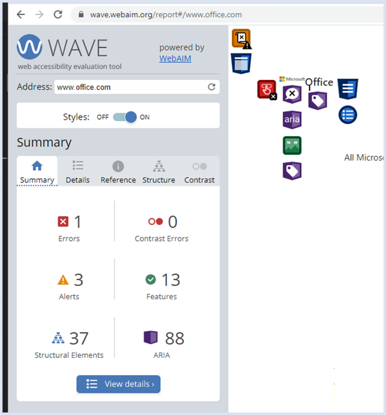
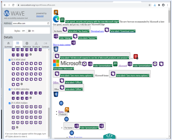
The wave evaluation tool highlighted the following issues
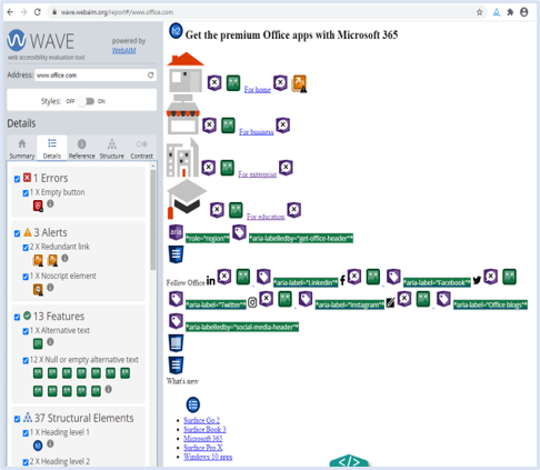
1 error: an empty button
3 alerts: 2 redundant buttons and 1 Noscript element
12 null or empty ALT text:
37 structural elements:
88 Aria items were highlighted as follows:
18 Aria
30 Aria Labels
11 Aria tab index
29 Aria Hidden
Details of Wave Accessibility tool evaluation
Contrast analysis on contrastchecker.com
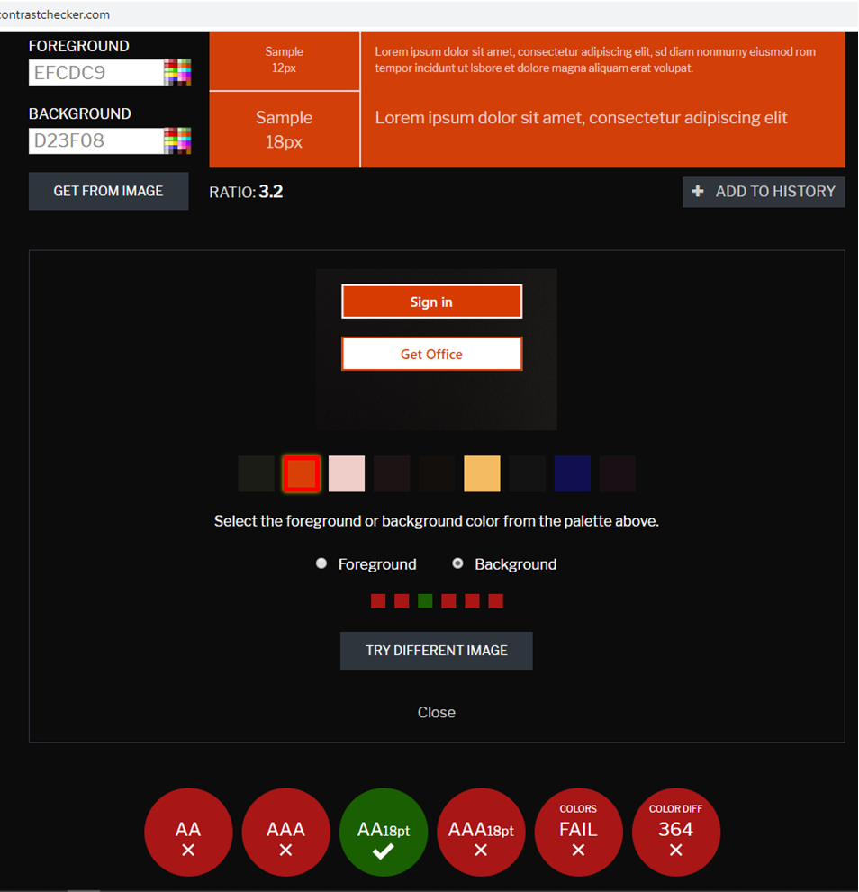
Based on the contrast issue I observed, which was also highlighted by the AXE evaluation tool, I checked the contrast of the ‘Sign in’ button on contrastchecker.com
The contrast ratio between the foreground and background colors was 3.2
Background color:
#DB3F08 / RGB 219, 63, 8
Foreground/Writing:#EFCDC9 / RGB 239 205 201
It failed the WCAG 2 AA contrast ratio threshold which is a minimum of 4.5 : 1
Analysis of color blindness using the Toptal colorblind web Page filter
Three color blindness issues examined were:
Protanopia red-green color blindness, with anomalous green cones
Deuteranopia red-green color blindness, with anomalous green cones
Tritanopia blue-Yellow color blindness, with anomalous blue cones
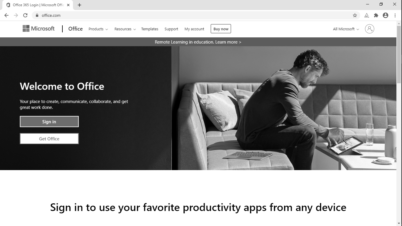
These did not affect contrast negatively but some icons for MS office programs changed color.
However, since the program icons were properly titled, it will not confuse the user.
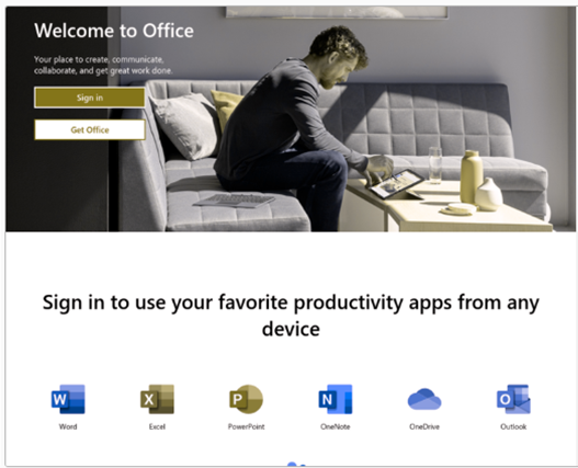
Protanopia
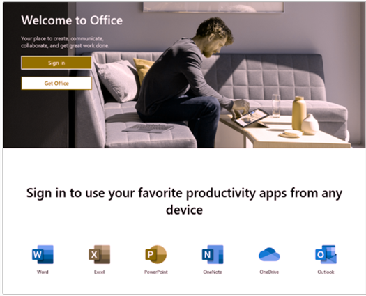
Deuteranopia
Triptanopia

Recommended Actions
Based on the findings of the 7 stages of analysis, I have made the following recommendations:
For the footer, black or very dark grey would give better contrast with the light grey background.
Using a darker shade of orange in the get office and sign in buttons can increase the contrast
Focus states should be shown with solid lines and not dashed lines for better visibility
Empty or redundant buttons and links should be removed
All pictures should have alt text
All tab index attributes should be checked to ensure that they have a value of 0
All aria items should be appropriately labeled
Recommended Actions continued
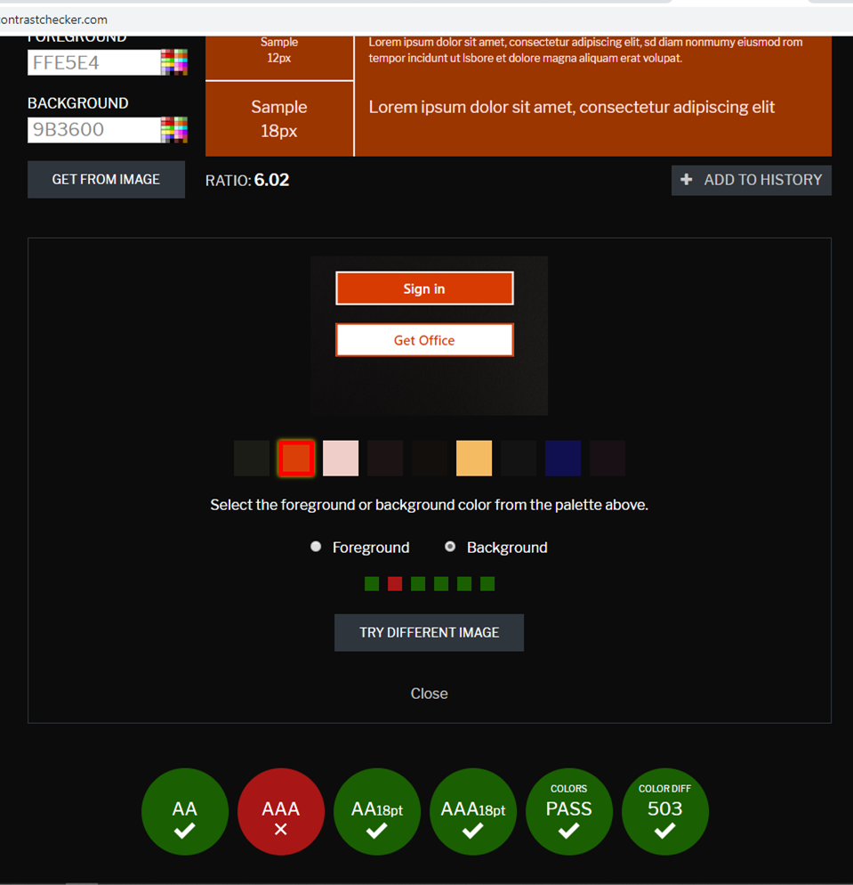
To meet the contrast specifications but remain similar to the original colors, I suggest the color combination as follows:
Background color:
#9B3600 / RGB 155, 54, 0Foreground/Writing:
#FFE5E4 / RGB 255, 229, 228Contrast ratio: 6.02
Reflection
Carrying out this analysis, has helped me become more conscious, of the ways accessibility issues could be addressed at the design stage.
I also learnt that although screen readers aid accessibility, it is important to go beyond the use of various screen readers in determining accessibility of a web or mobile app.
Most importantly, it is essential to include users with disabilities in user research and testing, to ensure a good accessibility experience for all.
Acknowledgements
I would like to use this opportunity to thank the creators, of the images used for the sections:
Evaluation without accessibility tools - Photo by Bryan Geraldo from Pexels
Recommended actions - Photo by Breakingpic from Pexels
Thank you for looking at my case study
I would like to work with you, please contact me.
Contact Me
Let's create great experiences together!
