Chineme Ozumba
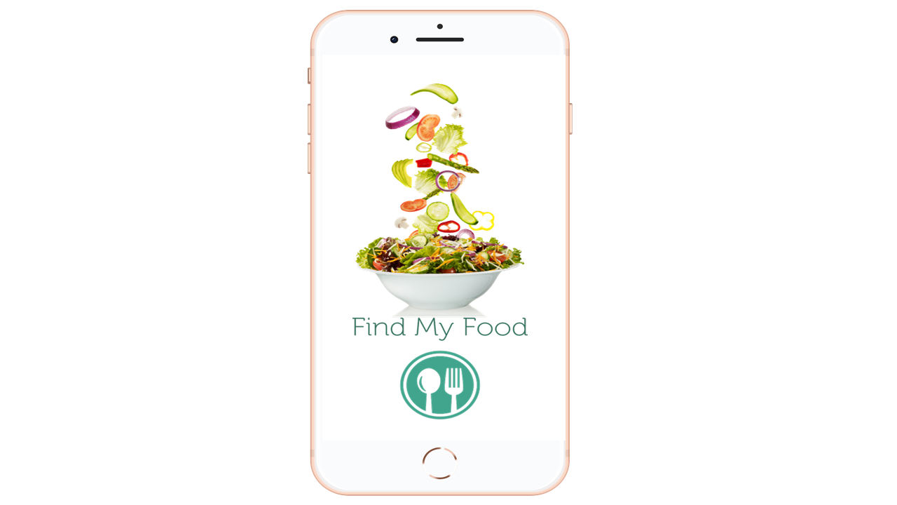
Splash screen of Find My Food Mobile app

Mobile UX - Find My Food

Designing a next generation mobile food delivery app with user research insights.

The Challenge : In February 2020, when the COVID 19 lockdowns began in different parts of the world, it occurred to me that obesity would increase along with the risk of lifestyle illnesses like heart disease, and diabetes, because of less movement. 
For those dependent on food delivery services, knowing the calorie content in their food could help. Unfortunately, the top three food apps: DoorDash, UberEats and GrubHub do not support calorie tracking.
Further research revealed other user needs and pain points with food delivery apps, raising the question:
What features would make a food delivery app ideal for users?
  • User Centered Design
  • Mobile UX 
  •  User Research

Strategy

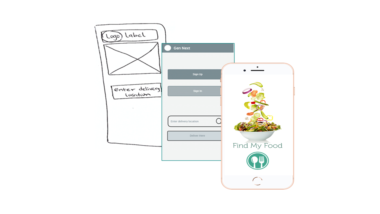
Wire frames of Healthy food, Gen Next and Find My Food

I leveraged design thinking in designing the app. 

I started by empathizing with users that struggle with weight and their need to monitor the calories in the food they buy on food apps. Next, I carried out further research, to discover user pain points in existing food apps and features users would like to see in their ideal food app.  

I designed the app in 3 broad iterations. 

Stage 1 – Healthy Food

Stage 2 – Gen Next

Stage 3 – Find My Food

Stage 1

Healthy Food

In this first iteration,the design process aligned with the Stanford d.School design thinking model as follows:

Empathizing with users, defining the problem, generating ideas and producing prototypes and flow diagrams. Details are outlined below.

Empathy

Thinking about the COVID-19 restrictions from my Public Health perspective, risk of obesity and related lifestyle diseases  would increase.
Food delivery app users need to know the calorie content of the food they buy. 

Problem Definition

Food delivery apps do not have calorie monitoring capacity.
How can users monitor their calorie consumption on food delivery apps? 


Idea generation

I brainstormed alone and generated the idea of a food app that would include the number of calories in each meal and allow users to filter food by amount of calories.  

Prototype

I hand sketched the app idea.
I then produced a user flow diagram and a wire flow diagram using Lucid Chart

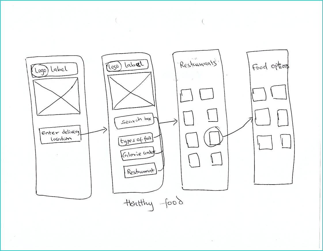
I hand sketched the app idea for Healthy Food, showing the idea of filtering food by type, calories and restaurants.

Hand sketched wire frame for Healthy Food app


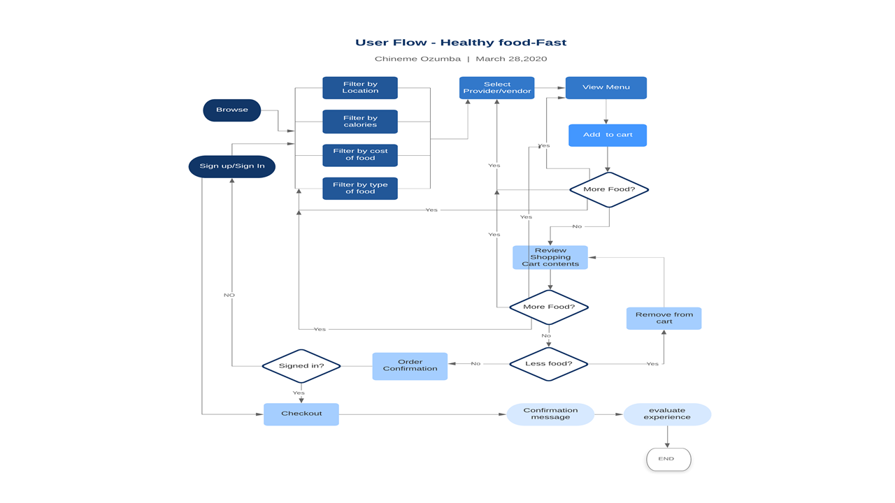
To show the logic behind the app, I built the user flow diagram for Healthy Food with Lucid Chart.

In this iteration, I used four filters: Location, calories, cost and type of food. These filters all lead to restaurants (providers or vendors), where the user can select their restaurant of choice and then choose food options from the menu.

In this model, a new user has the option to sign up first or try out the app, before registering at the point of payment.

User Flow Diagram of Healthy Food


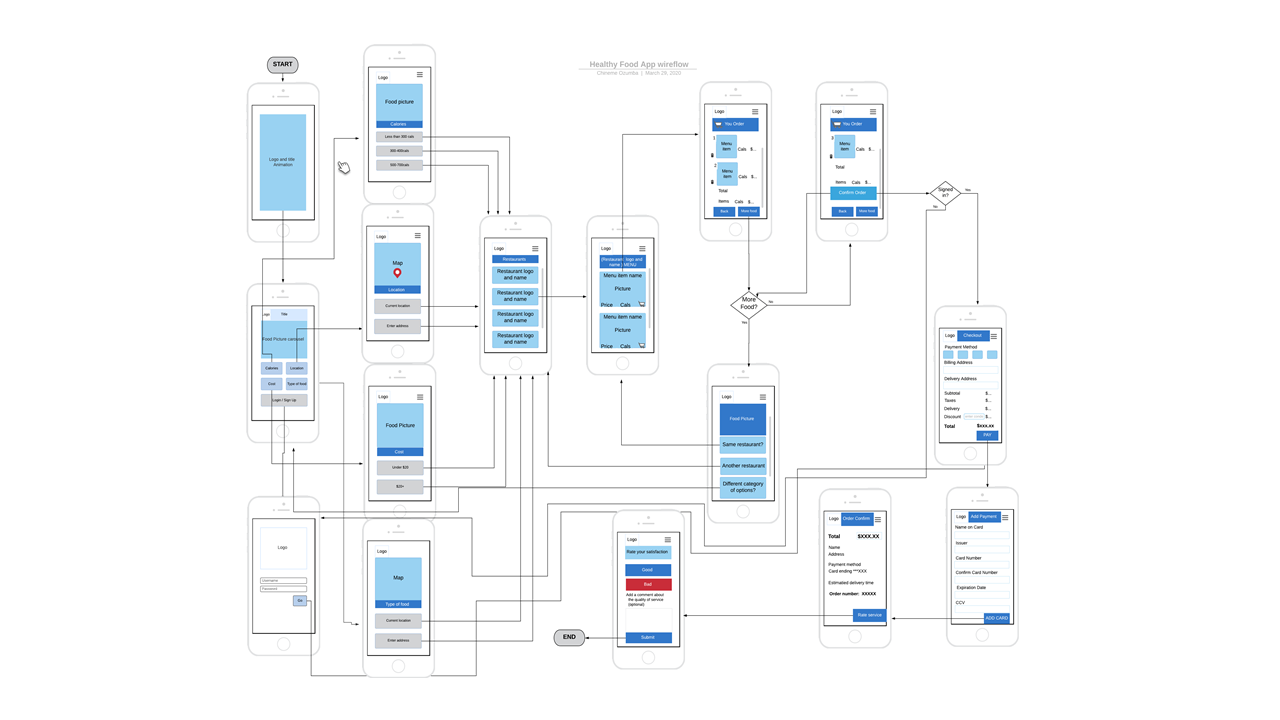
I also built a wire flow diagram with Lucid chart to show the logic of the app while giving a idea of the visual composition of the app. 

Wire flow diagram of Health Food


Stage 2

Gen Next

In this second iteration, I did further research:

  • To find out other pain points that users may have with existing food apps.

  • To discover the features users would want to see in their ideal food delivery app.

Competitor Analysis

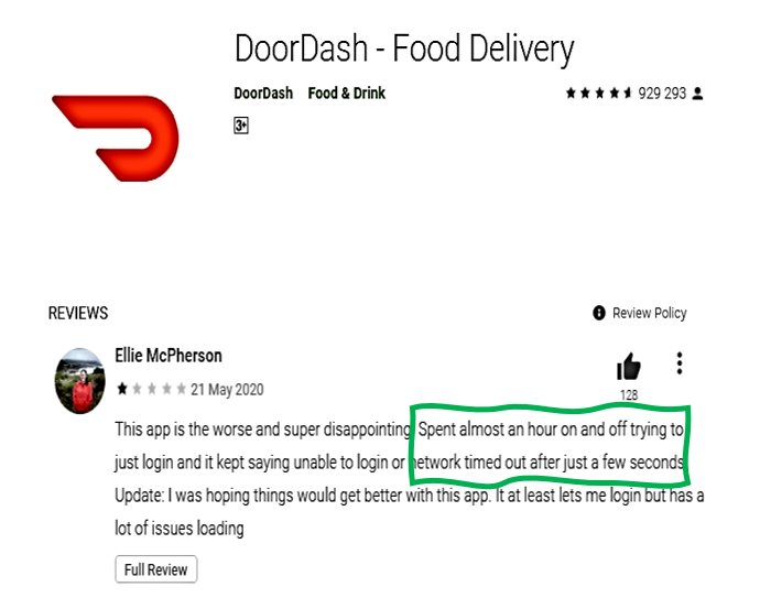
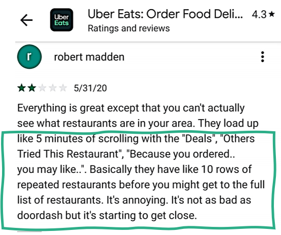
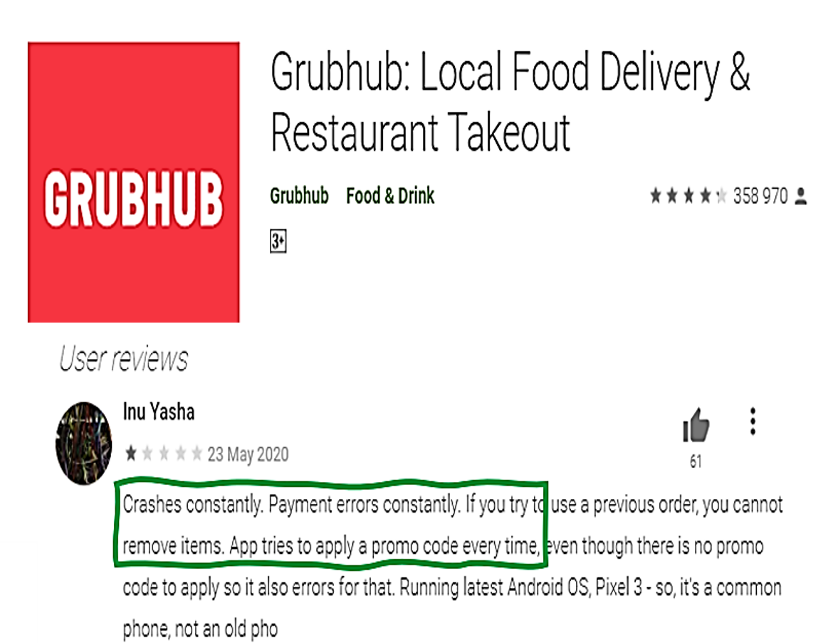
I analyzed user reviews of the IOS and Android apps of the top 3 food delivery apps in USA (Grub Hub, Uber Eats and Door dash). 1-star to 3-star ratings were studied to identify the pain points of user

User Interviews

I interviewed three users through What’s App video call. What’s App was used because the interviewees were comfortable with that medium. I was unable to record the call and took notes instead. 

Discovering Themes 

I did a thematic analysis was on the user review ratings and the user interview responses and generated themes

Persona creation

I generated a composite persona (Carole –career builder) from the findings.

Journey mapping

I mapped Carole's journey in using the app, reflecting the pain points identified.

Wire framing 

Wire frames of key screens were produced using FluidUI

Analysis of User reviews and interviews

I coded various pain points with different colors.

For instance any pain point related to timing was outlined with green color.

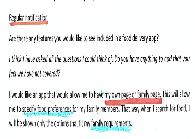
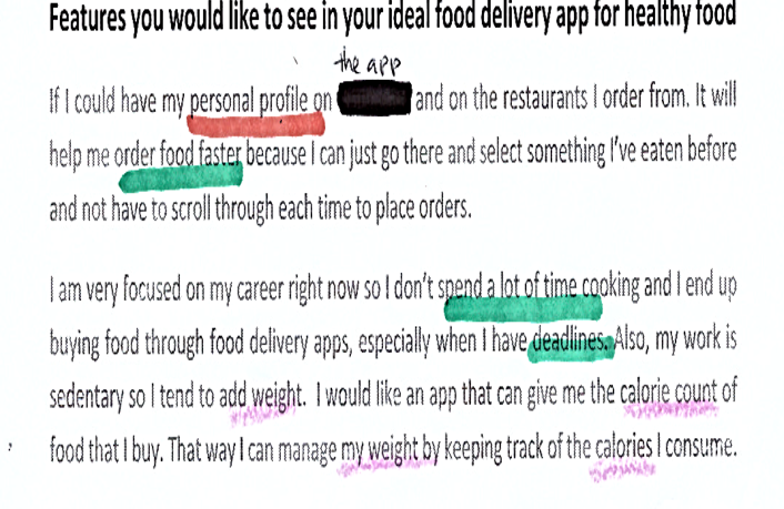
Below are excerpt from user interviews and user reviews.

User Interviews
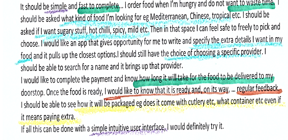
Excerpt from User-1 interview
Excerpt from User-2 Interview
Excerpt from User-3 interview

 User Reviews

Excerpt from User-1 interview
Excerpt from Uber eats user review
Excerpt from User-2 Interview

Generating themes

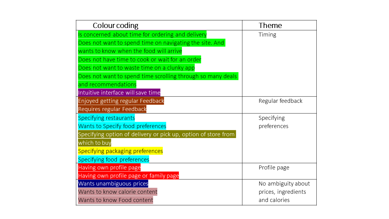
I combined related pain points to generate five recurring themes which show what users want.

  1. To spend as little time as possible on tasks.

  2. To receive regular feedback at all stages.

  3. To be able to specify their preferences in food, restaurants, delivery options, packaging etc.

  4. To have a personal profile, which increases the apps capacity to  deliver more intuitive food options for them. 

  5. To have complete clarity on food prices and content such as ingredients and calories.

Below is a table showing how the coded pain points were grouped into themes.

Thematic analysis of user interviews and user reviews


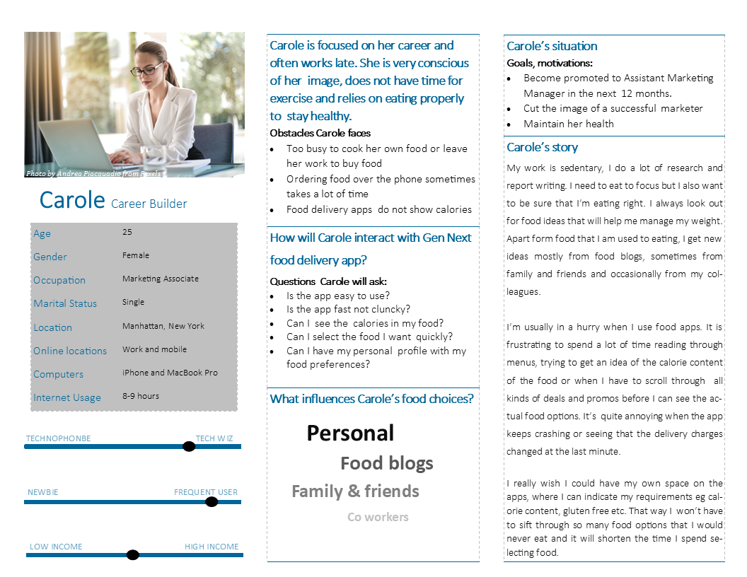
Persona:

Carole the Career Builder

I built a persona called Carole, who experiences the user pain points discovered from research. She is a single, 25 year old, female Marketing Associate working in Manhattan. She is too busy to cook or even leave her work to buy food.

In her own words

I need to eat to focus but I also want to be sure I'm eating right. It is frustrating  to spend a lot of time reading through menus, trying to get an idea of the calorie content. I wish  I  could have my own space on the app where I can indicate my requirements.
Persona description of Carole the Career Builder


Carole's Journey Map

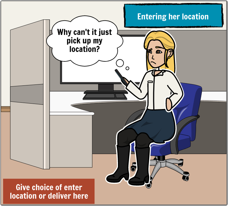
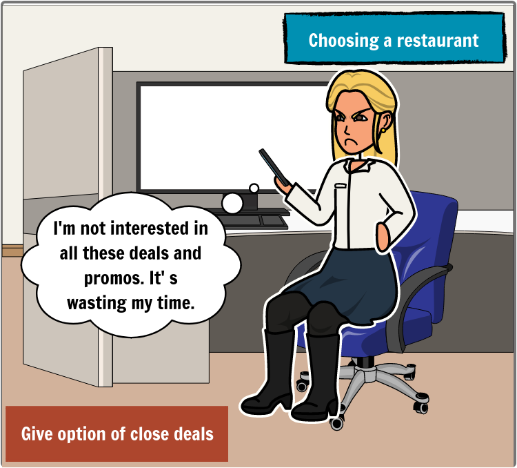
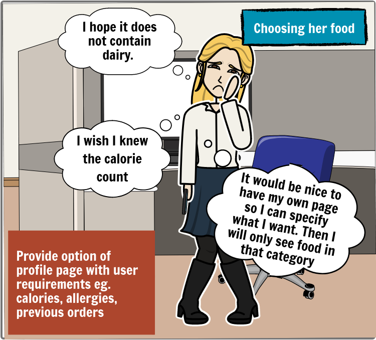
To help generate more empathy for users, I created a storyboard to map Carole's experience, in using a food delivery app. 
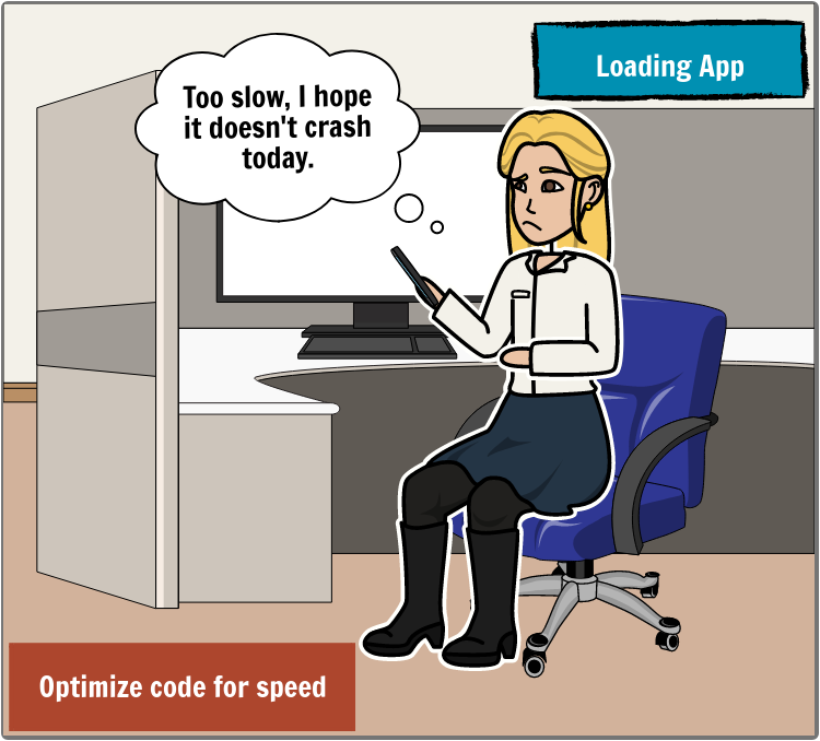
Carole frustrated at slow load time
Carole irritated at having to enter delivery location each time
Carole angry that she has to scroll through so many deals
Carole worried about calories and dairy in her food. She wants her own personalized page with preferences
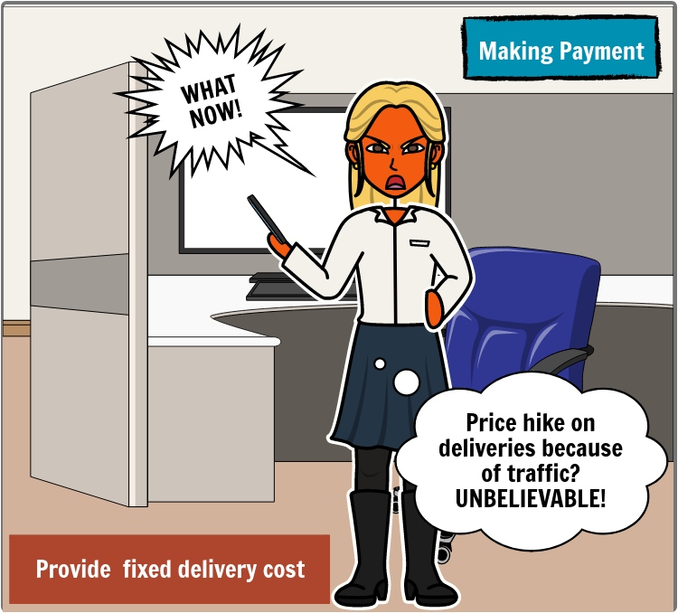
Carole very angry that delivery prices changed at the last minute
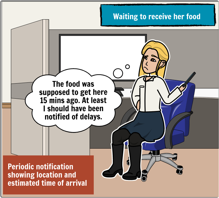
Carole disappointed that the food is late and no notifications sent why it is late

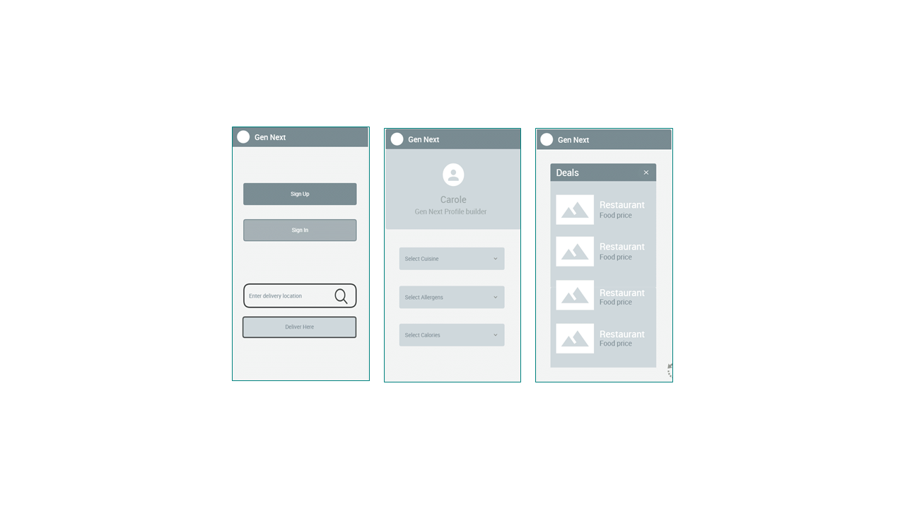
Wire frames built with FluidUI

I built wire frames of  key screens as follows:

  1. Login/browse screen giving the options of signing up or going ahead to start the ordering process by entering location or delivering to the users current location.

  2. Personal profile page with various specification options.

  3. The deals page with option of exiting deals.

3 Wire frames for Gen Next app


Stage 3

Splash screen for Find My food App

Find My Food

In the third Iteration, the name of the app was changed to 'Find My Food', to be more intuitive.

A logo was designed with the name and an icon of an empty plate with cutlery.

A splash screen showing the picture of a salad and the logo was built with Adobe XD.

Final results

A fast, intuitive, user friendly, food delivery app that gives gives clear information on pricing and food content.

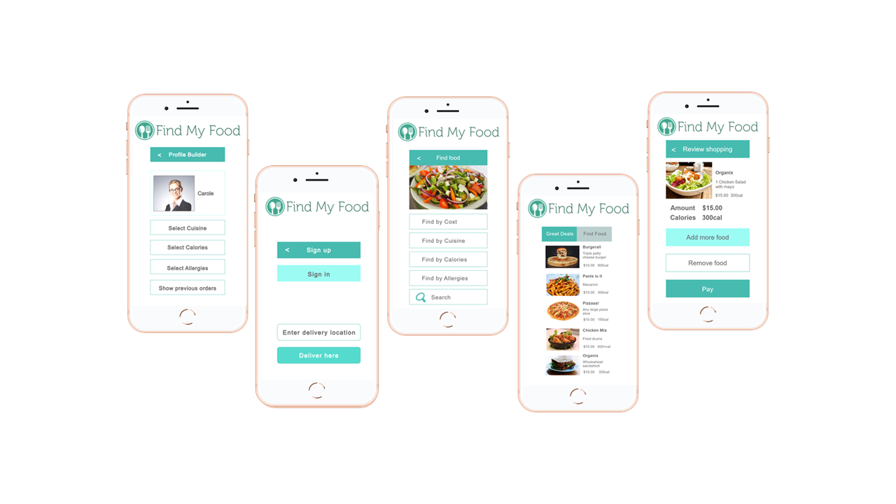
Below are other key screens based on the discoveries made in the user research:

  • login page/ browse page,

  • profile page

  • filter page

  • deals page

  • and shopping cart.

6 key screens of Find my food App


Reflections

My key takeaway from this project is that investing in user research early in the design process, saves a lot of resources and ensures that the product is relevant to user needs.

For instance, my point of view about food specifications and food delivery services was quite narrow when compared with the insights I gained from interviewing users and analyzing user reviews.  
Without adequate user research, I would spend resources on creating an app that will not be used.

Appreciation


I appreciate the creators of the images used in this design 

iPhone Photo by Unknown Author is licensed under CC BY-SA
Carole – persona Photo by Andrea Piacquadio from Pexels

Carole- profile image by Igor Link from Pixabay  

Thank you for viewing my case study


I would like to create great user experiences with you!

Contact Me

Name E-mail Message Submit