
Keyboard Test
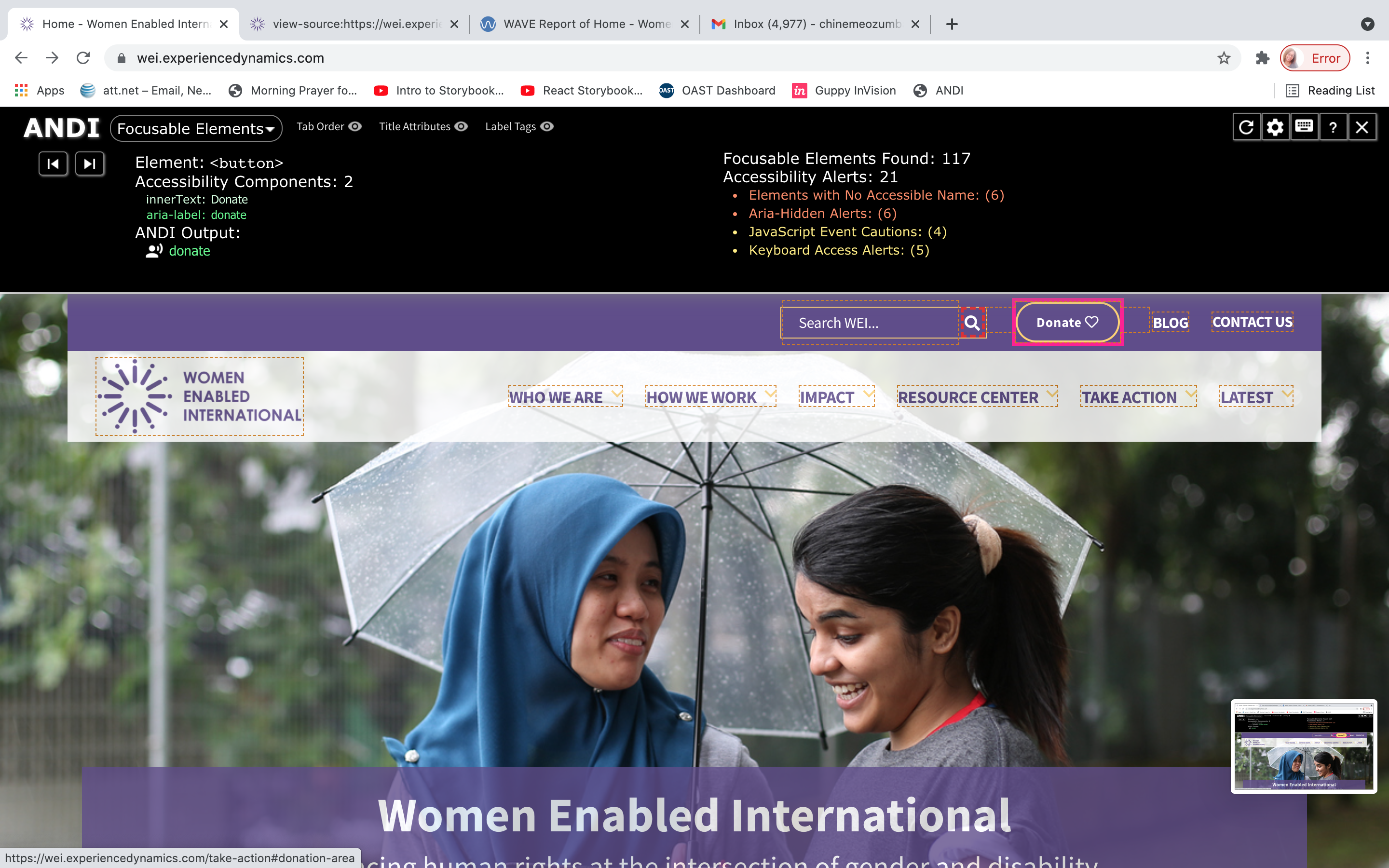
Tabbing through the site was difficult because some elements had invisible keyboard focus state.


Tabbing through the site was difficult because some elements had invisible keyboard focus state.

Several elements did not have keyboard or hover focus.

There were no multimedia content which would require transcripts or captioning.

There were no red or green colors in the color scheme of the website
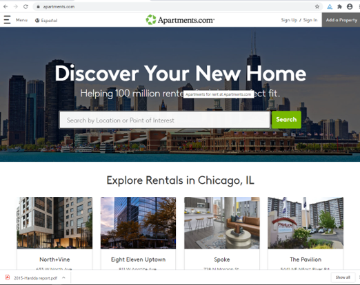
There was no automatic dynamic content, which could lead to seizures.

The pages was not cluttered which will give a good screen reading experience for the visually impaired
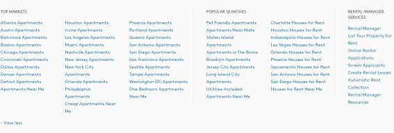
Unordered lists were used in the footer of the home page. This could increase difficulty for people with cognitive disabilities.
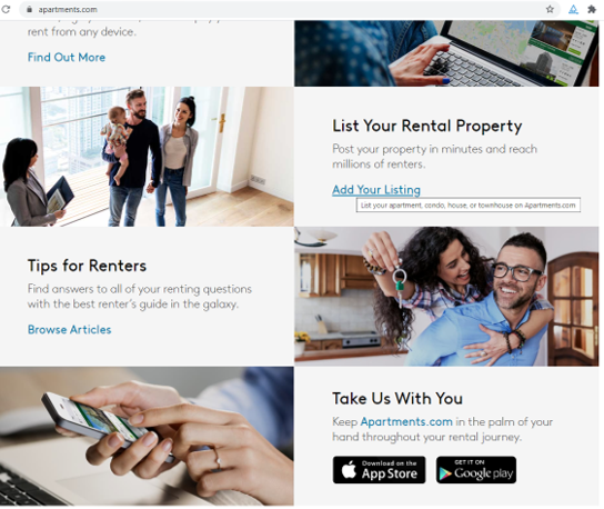
Some links were not underlined, while some opened on a new browser tab. This is not good practice because blind users find it difficult to access new browser tabs.
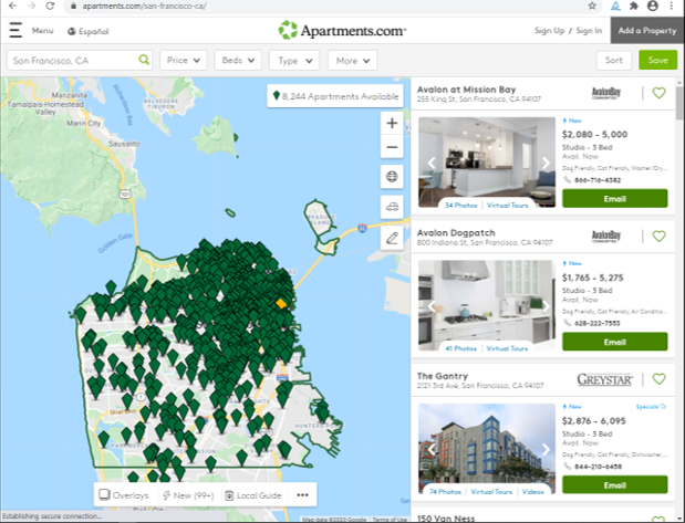
The use of H1 and H2 headings was inconsistent on the website which will make it difficult for screen readers to differentiate between sections.
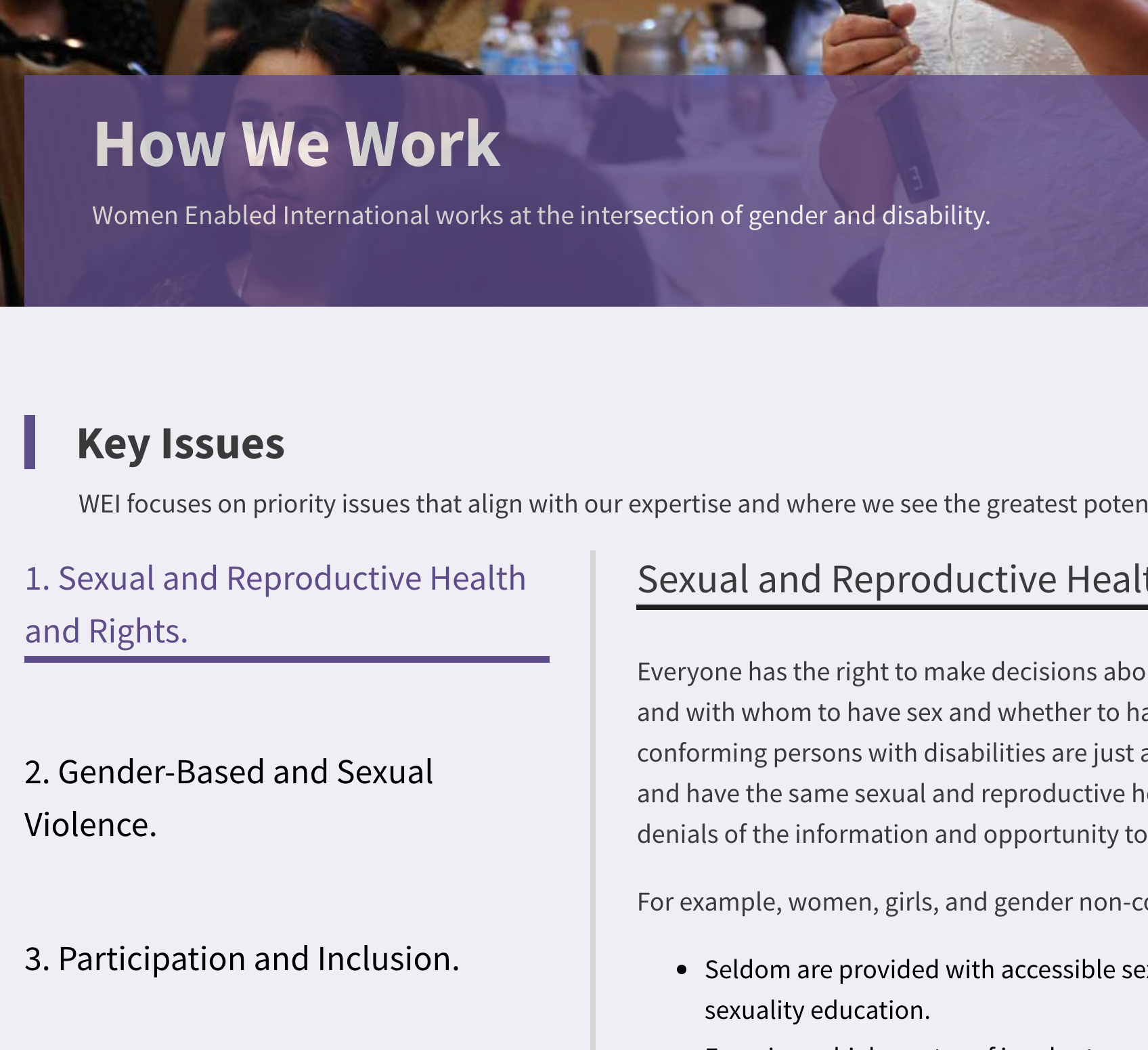
Font family used throughout the page was 'Inter Var', a sans serif font which is good for reading from computer screens.

For different screen sizes, there was no loss of information or functionality and no need to scroll in two dimension.

Text can be resized without assistive technology up to 200 percent without loss of content or functionality.

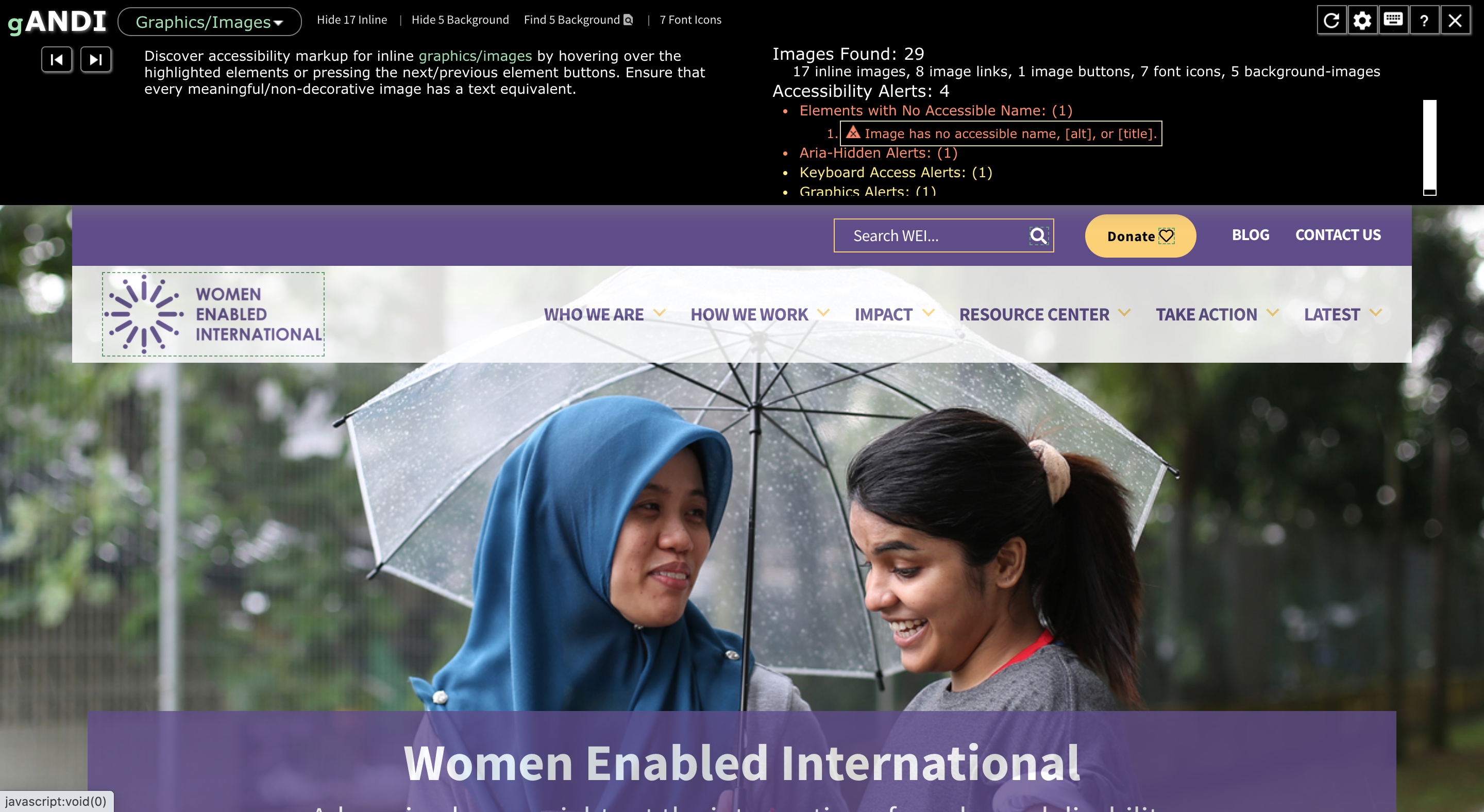
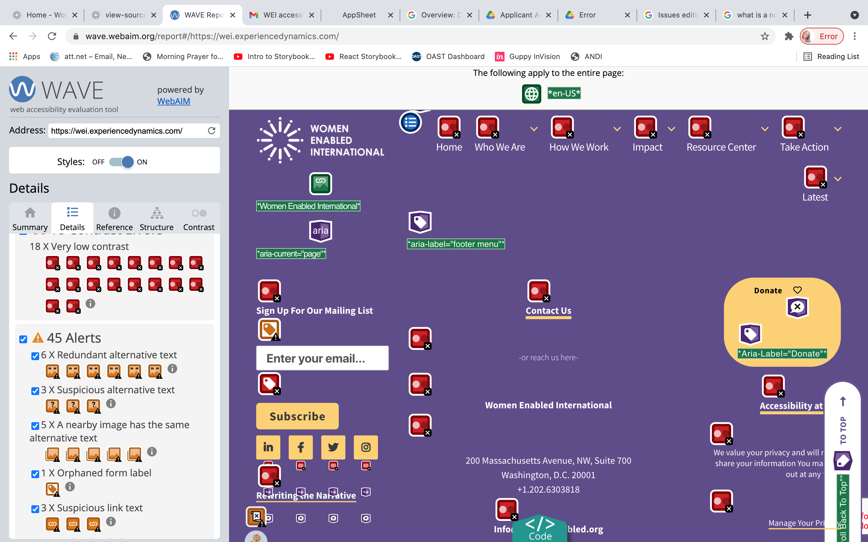
Summary of issues identified on home page
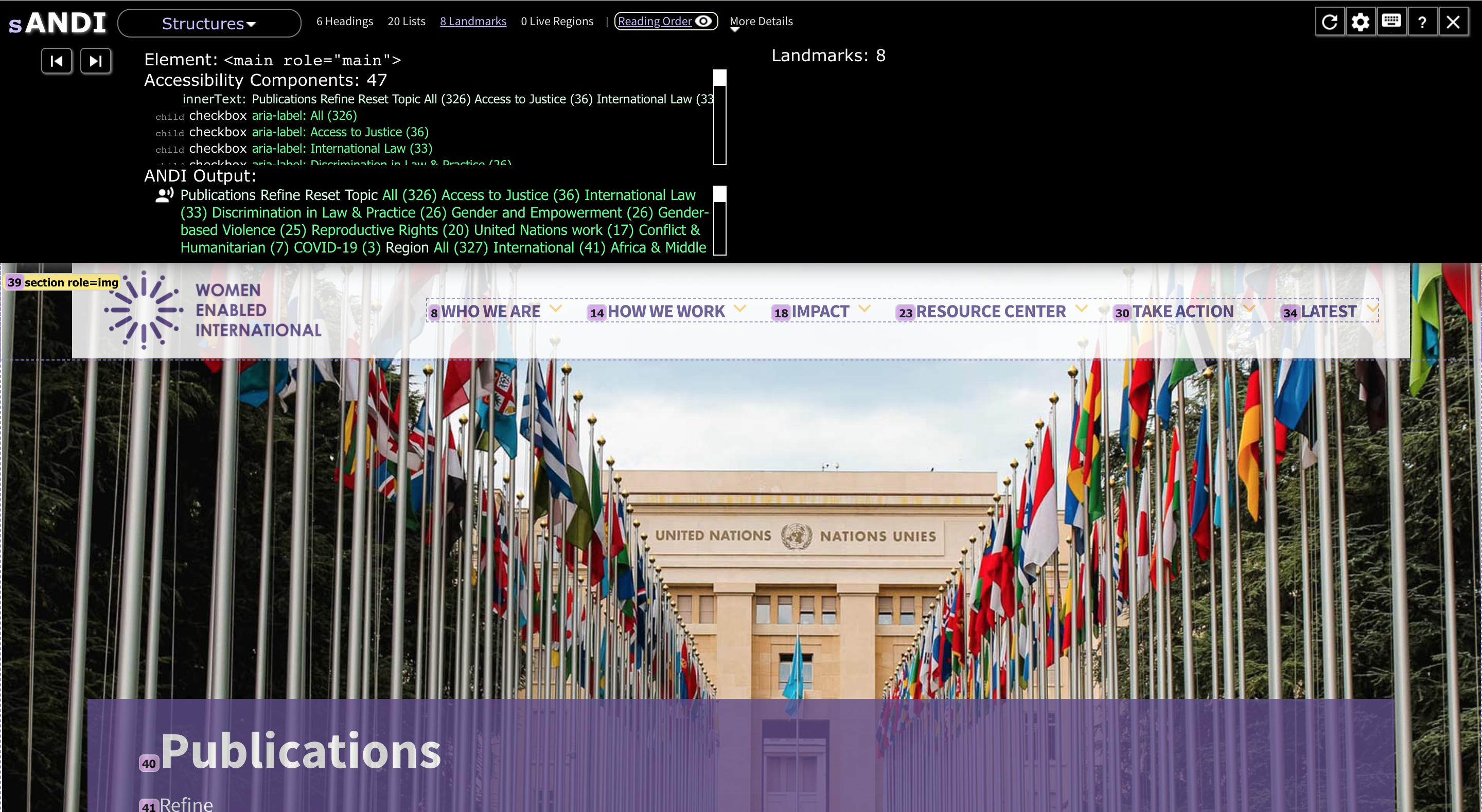
Summary of issues identified on the search result page
Poor contrast

Empty headers
Screenshot of search results for apartments in Chicago, IL
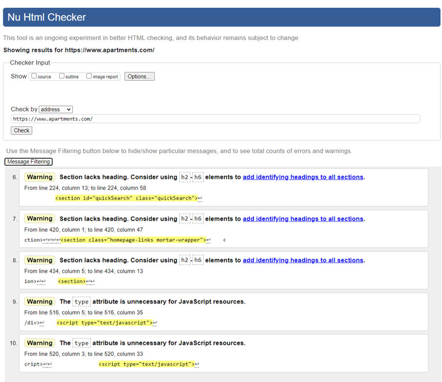
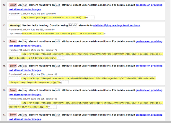
Errors identified include:
The absence of 'lang' attributes.
The absence of heading (H2-H6) elements, which can confuse users using screen readers.
The absence of alt text on images.
Empty links.
For the footer, black or very dark grey would give better contrast with the light grey background.
Focus states should be thick solid lines with glow property for better visibility.
Empty or redundant buttons and links should be removed
All pictures should have appropriate alt text.
All tab index attributes should be checked to ensure that they have a value of 0. All aria items should be appropriately labeled
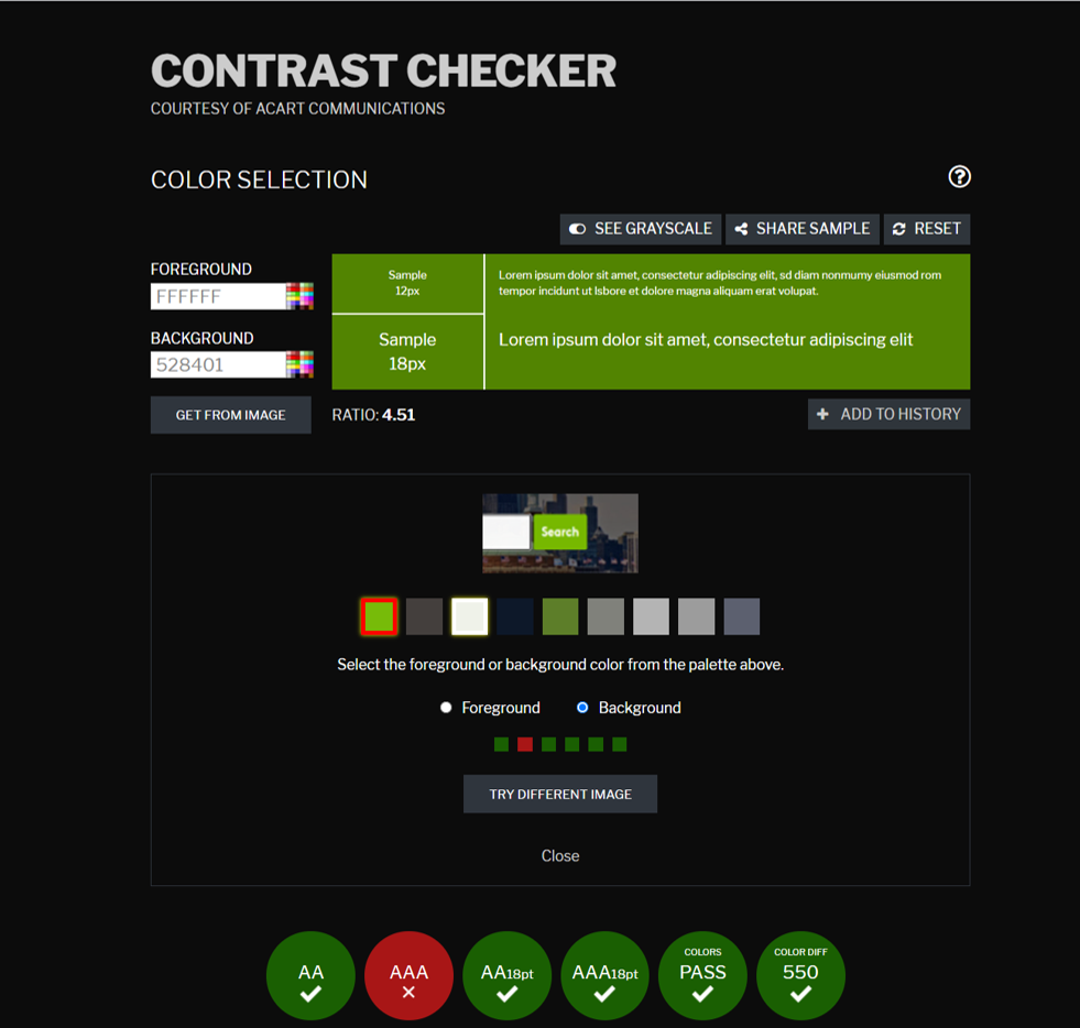
Using white on a darker shade of green in the search buttons can increase the contrast.
To meet the contrast specifications but remain similar to the original colors, I suggest the color combination as follows:
Background color:
#528401 / RGB 82, 132, 1
Foreground/Writing:
#FFFFFF / RGB 255, 255, 255
Contrast ratio: 4.51
Carrying out this analysis, has helped me become more conscious, of the ways accessibility issues could be addressed at the design stage.
I also learnt that although screen readers aid accessibility, it is important to go beyond the use of various screen readers in determining accessibility of a web or mobile app.
Most importantly, it is essential to include users with disabilities in user research and testing, to ensure a good accessibility experience for all.